Last year I worked on the TTEITI project and I posted a summary of this project on my website and I wrote a blog on the proces. In this blog I will show the end-result in a bit more detail.
To start, I had to design a banner, in a gif format. This was the end-result (the text will show in te middle, as you can see on the TTEITI website):

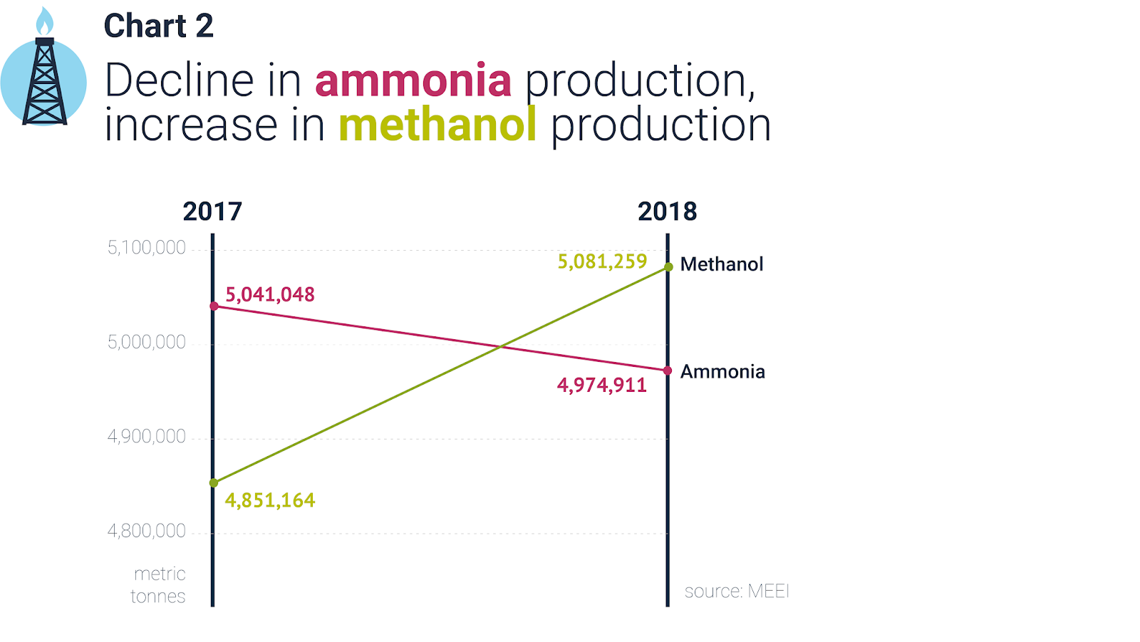
Then I designed a series of graphs, like this simple slope chart that compares the ammonia and methanol production for 2017 and 2018. I would have liked a bit more storytelling in the title, but I didn't have enough info and deadlines were tight. For instance, I could have used the title to explain why this data is relevant or interesting.
Some of the charts were static, but in the publishing tool TTEITI used, there was also room for scrollmotion effects, where the image changes while scrolling the page. For dataviz this offers interesting possibilities. Like this simple barchart (sorry for the bad video quality, this is not my expertise, you can see the effect is smoother if you try it yourself on the TTEITI website).

The scrollmotion makes it really easy to tell stories with the charts and in this case focus on the fact that there is an enormous amount of outstanding revenues.
Another chart where the scrollmotion worked really well was this linechart:
I used the scrollmotion to build up the story that the fund is not managed properly.
All in all this was a very interesting project where I could explore the possibilities of scrollmotion for storytelling with data. You can check out more of my work on my website.
Reacties